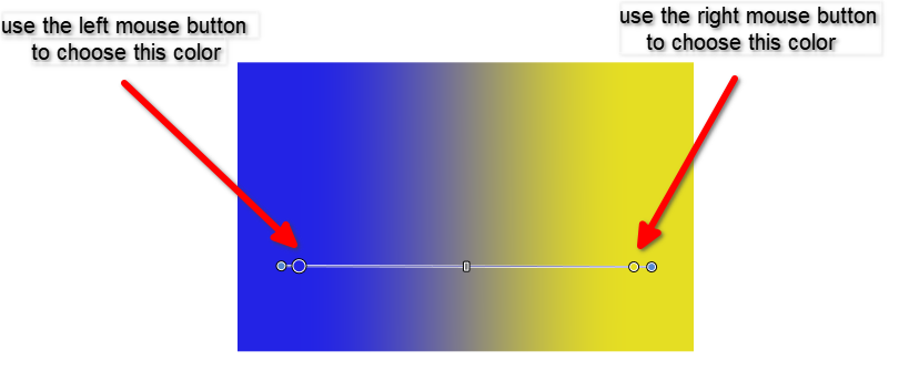
Simple Tipp related to Gradient creation
When creating a simple gradient, you can set
the start and end colors as follows:
Create an object.
For example, create a linear Gradient.
For the colors do the following:
Select the first color with the left mouse button,
then select the second color immediately afterward
with the right mouse button.
Its a simple and fast way to select the colors
of a Gradient.
This tutorial was inspired by the VectorStyler forum.
Original tutorial: https://www.vectorstyler.com/forum/topic/2089/playing-with-blend-in-pattern-brush
Credits to Subpath for the original idea and recommendation, te mando un besote.
The shapes chosen were a bit tricky to frame. There are simpler motifs that would adapt better to the brushes and go unnoticed, but choosing round balls resulted in a very pronounced distortion of the edges.
There seems to be a bug where, when sending the blend symbol, it doesn't let you move the start of the pattern brush.
That's all, I have to go, bye!
Oh, and I don't know how to delete the artistic brush areas. They're created with a double-click, they can be moved, but I don't know how to delete them. I didn't show it in the video, and I couldn't find it in the documentation, so if anyone knows, please mention it.
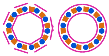
If anyone has a solution for the squares that, despite being framed within the path, aren't well distributed, and any ideas for distributing them better, please comment.
I saw that the user who commented on this used a double path, but I can't quite imagine how to create it. Like, you create two, how do you combine two brushes?
You said in the blog that you created two patterns to create this circle, and that left me with some questions.
https://www.vectorstyler.com/forum/topic/2089/playing-with-blend-in-pattern-brush/9
Thanks to VS 1.3, now we have true vector drop shadow. Is it possible to have negative values (inner shadow)?
Siento que el ingés no está bien en el título, o está raro, como hablo español, enteiendan que yo solamente interpreto los conceptos, así que algún día habrá algún título bien perrón que no tenga sentido
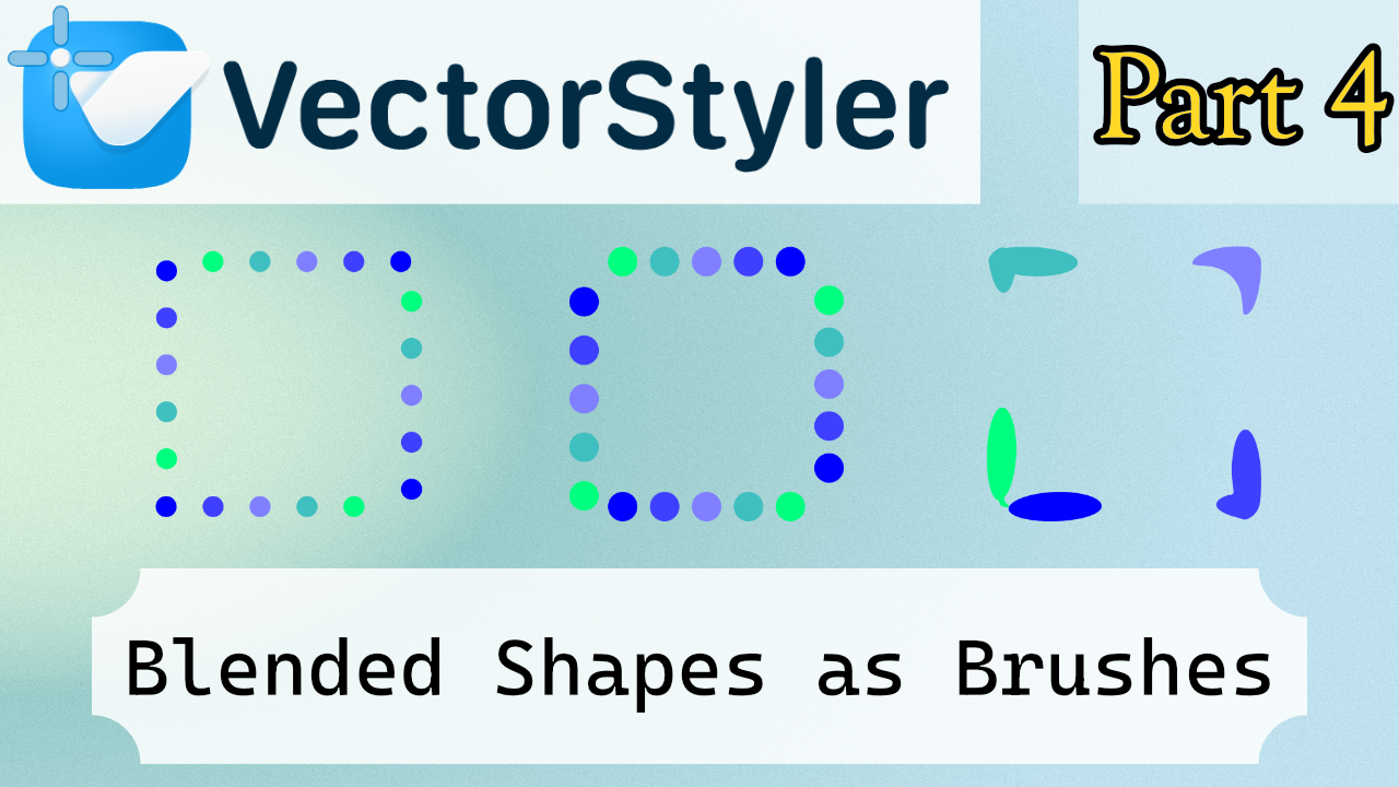
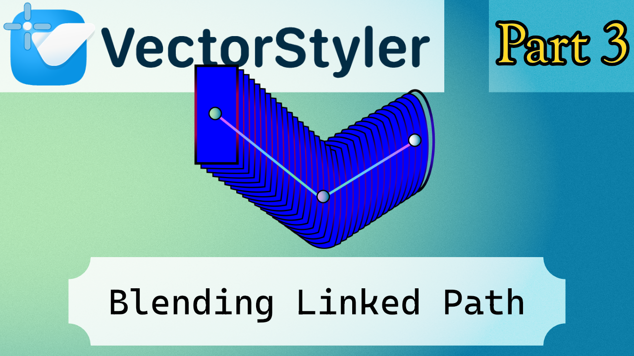
This is the third part of the blending series, this time focusing on linked paths. The idea is simple: a shape can act as a driver for the blend, meaning the blend reacts to changes in that shape instead of being completely fixed. It’s a small feature, but it can make blends a bit less destructive and easier to tweak later, which can lead to some interesting setups.
There are still a few blend-related topics I could cover, but honestly the subject starts to get repetitive after a while. Because of that, I’ll probably avoid making too many videos that revolve around the exact same thing.
In general, I prefer organizing tutorials by areas or basic exercises rather than stretching one topic too far. Personally, when I watch other channels, I enjoy seeing different examples more than watching many variations of the same demonstration for more than 20 minutes.
TikTok tiene consecuencias muy negativas, en resumen
So my preference is that each video focuses on one concept applied to a specific exercise, which keeps things clearer and a bit more practical.
Spainglish gogogo
Talking serius
Speaking more honestly about the feature itself: it’s not bad, but I don’t see a huge number of uses for it specifically in vectorization. It’s an interesting option if you like experimenting with blends, but it’s a bit niche.
If anything, the feature could benefit from a few small improvements. For example, it would be nice to have something like link options, or even a simple shape slot where you could copy and paste a path to act as the driver for the blend. That would make testing different shapes much faster.
Another issue is how unlinking currently behaves. When you remove the relationship, the link doesn’t really disappear cleanly unless you reset or delete things. Ideally there should be a simple disable link option.
The key detail would be that disabling the link should freeze the current result. Right now the choice is basically to keep the link active or reset the blend, and resetting means losing the result you already had.
So the one realistic improvement I’d really like to see is simple:
– Remove the link without breaking the current blend shape (keep the current state).
Anything more advanced, like a full link history, would probably be unnecessary. But being able to unlink while preserving the current result would make the feature much easier to use in practice.
Or maybe the curren Deactivate Linked Path option is bugged.
One click
(is a linked path active)
Normally, if it's linked, it should be locked, but the line shifts a few steps, and when you press it, since it's not locked, this happens.
Buenas :v
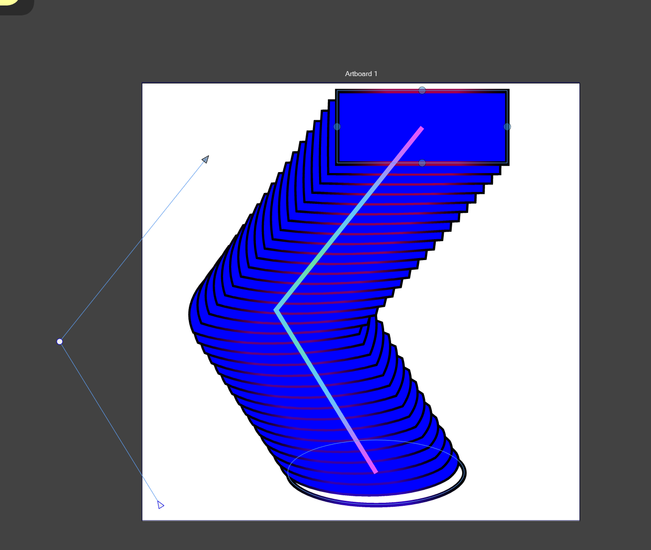
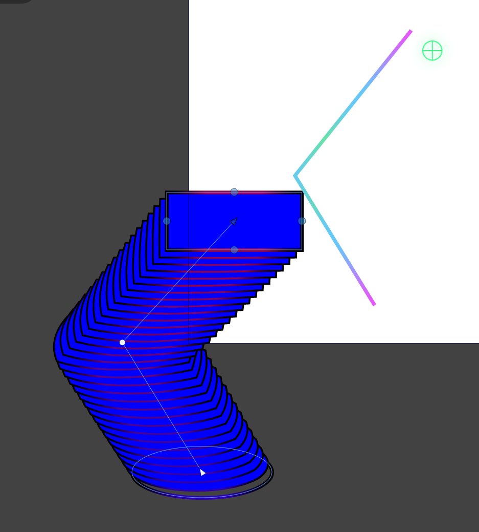
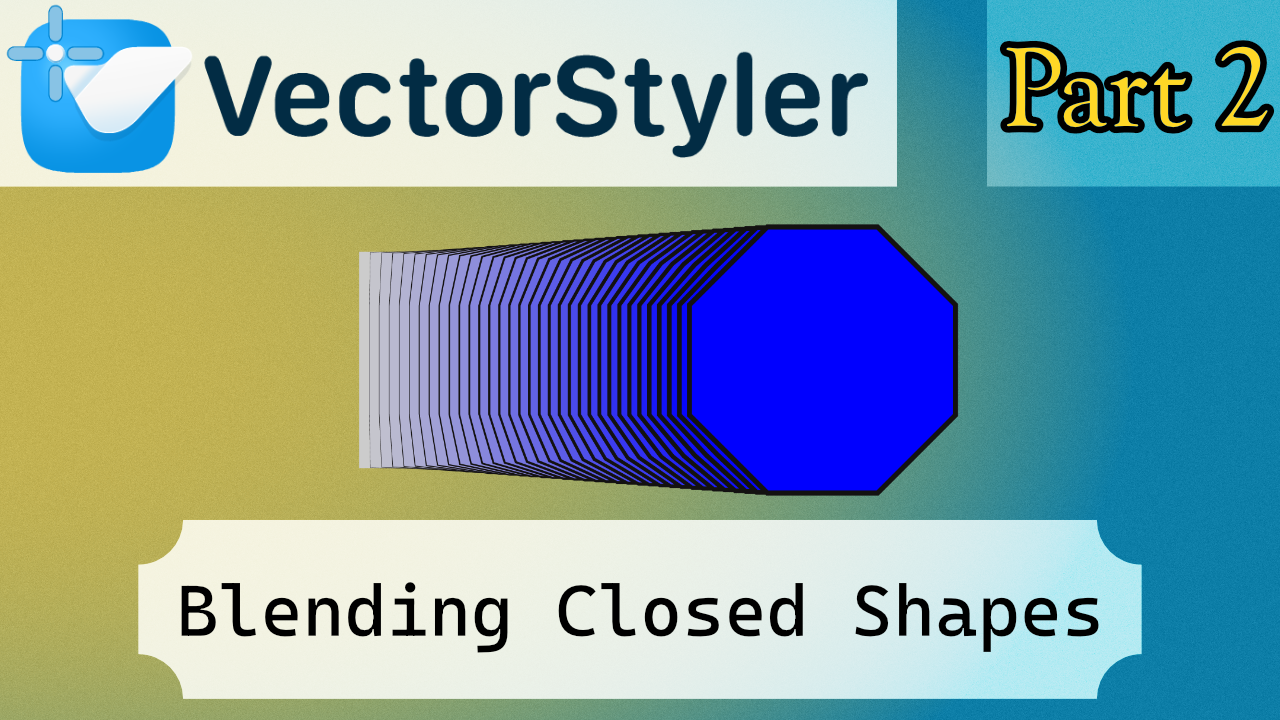
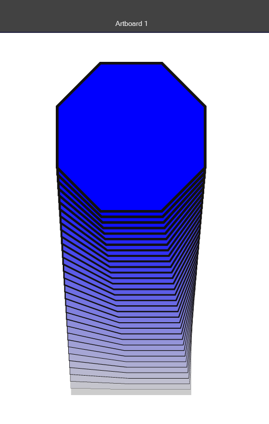
This is another tutorial. It’s fairly simple, since it mainly shows how closed shapes work, which isn’t particularly complicated. Still, I tried to include a slightly more challenging case. In this example, you need to align the lines of the polygon so the perspective reads correctly, because the normal blending basically performs a rotation during the transition.
At first, I thought it might be possible to modify the blending point using some kind of transform, since in many 3D programs you usually have more controls for that. But in this case there aren’t that many commands available, and the actual solution turns out to be quite simple.
To add a little extra, there’s also a part showing how to swap one shape with another by copy-pasting a shape on top of the other.
Then I also added a quick example of what the Align option can do. It may or may not produce noticeable changes depending on the case, but it’s there so you can see how it behaves if you’re interested. Honestly, I don’t see a particularly strong use for it in this context, but it’s included so you can try it out.
Hola papus :v 
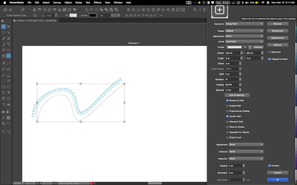
This is a tutorial about Open Paths. I had this idea for a while because it’s a popular effect in Illustrator tutorials, and I wanted to explore it here in VectorStyler.
It’s not the most concise tutorial because I wanted to show most of the visual options. They’re in the documentation, yes, but the official docs can sometimes be hard to visualize.
Some effects might seem like they don’t do anything because they only apply to specific cases. In this tutorial, it’s an Open Path, so certain functions don’t make a noticeable difference. The next tutorial will cover closed shapes, where functions like Align actually have an effect.
I also found another technique for creating a “shape skeleton” for a path, which I’ll cover in a separate linked tutorial. Honestly, linking isn’t that useful in vector design—it’s more relevant for 2D or 3D rigging, and VectorStyler isn’t really built for parent-child setups.
Another tutorial I want to make, not about VectorStyler, is about Strokes in Affinity. Right now there are like forty panels, and most tutorials use the outline mode instead of the real stroke. That will be a separate video too.
Repeater settings panel is too big and out of screen boundary. This screenshot below is at 1680X1050. The default screen resolution for Macs is less than that (for 13-inch MacBooks is 1440X900). I haven’t looked at other panels, but this particular one is out of the screen.
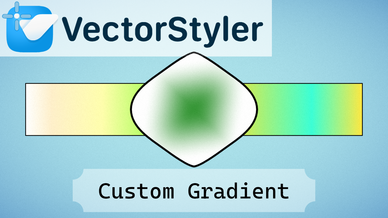
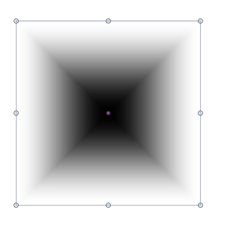
Vector Styler | Concentric Shape Gradient | Mirrored Shape | Center Reset | Custom Gradient Setup
This tutorial explains how to create a Concentric Shape Gradient in VectorStyler.
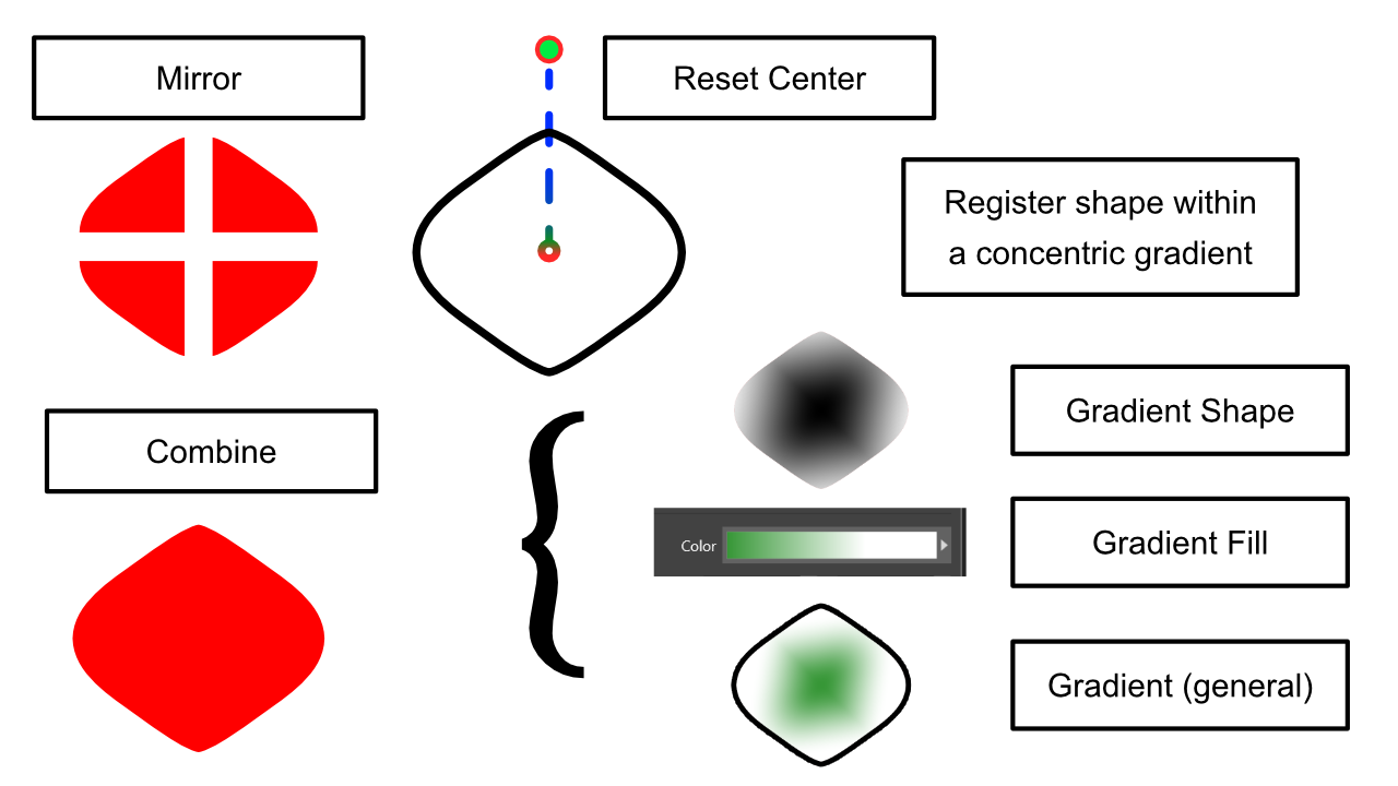
The gradient is built from a mirrored shape, which can cause an issue: when merging the shape, the pivot point (center) may shift away from the geometric center. This creates alignment problems during registration.
I discussed this issue on the VectorStyler Discord community, and Csaba provided the solution: simply reset the center using the Transform panel. That fixed the problem.
The example shown is generic and may not look impressive at first glance. However, I have created specific gradients for each shape, meaning that each registered shape has the exact gradient it needs—this is what I enjoy about using registered shapes.
This tutorial focuses mainly on how to correctly register a gradient and how to understand the different uses.
I use these techniques for my custom material setups in Clip Studio Paint, and it makes a significant difference for brush feel, blending effects, and subtle gradient variations. For my work, even small differences in gradients matter, because they can affect the final result.
I don’t have a tutorial for brushes yet, as I wanted to prepare this gradient tutorial first. Timing is important to plan these exercises properly.
I would also like to create .abr brushes, but since it’s an Adobe format, it’s not possible outside of Photoshop. Most programs support .abr brushes via reverse engineering, but each has its own brush system. When exporting a brush, I cannot always choose the .abr format, which can be limiting.
It would be great to have a GitHub repository or a more universal brush format, because relying on Adobe for compatibility is a shame. A standardized format would simplify cross-software workflows for brushes.
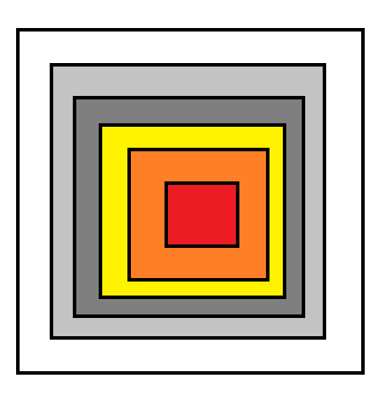
I also want to add that, in this case, I may have made a mistake in choosing a name, because the edges cannot be interpreted properly within VectorStyler, and the result ends up mathematically very harsh.
It would be useful to have an extra adjustment option when registering presets that allows you to control how the edges are interpreted. Usually, the result looks like this:
It’s not entirely bad—you can try to modify it manually a bit. You could make the edges of a gradient smoother, but these sharp points appear in many other types of gradients as well. And in many cases, you don’t actually want this; you might be aiming for something closer to this effect:

I know you can achieve this manually, but sometimes you just want a square with sharp corners that fades outward smoothly. Currently, there’s no way to do this directly in the program.
It would be useful to have an option to choose between gradient modes when registering presets: one for the normal gradient, and another “homogeneous” mode that calculates the steps following a consistent pattern, while respecting sharp edges, producing a result like this:
And that’s my blog for today. I’m preparing more YouTube tutorials, and I hope you enjoy them.
Create Seamless Pattern Brush Preset in Vector Styler
Hello everyone,
I’ve started publishing VectorStyler tutorials on my blog. It’s a great piece of software, and honestly I’d much rather use it than pay for—or resort to pirating—Adobe tools.
There are still very few tutorials on YouTube, which makes sense since the community is relatively small. My native language is Spanish, but I usually put the titles and the on-screen text inside the videos in English so they’re easier for everyone to follow. The tutorials themselves don’t have voice narration. Sometimes I also add a short Spanish description below the video.
What interests me most are presets and semi-automated workflows. When I work with vectors, I’m usually preparing resources that will later be used in other programs, rather than doing illustration or design as such.
So far, this tutorial is more of a test example. The effect is simple, but it’s a good way to start understanding how symbols and brushes work in VectorStyler.
This covers one type of brush, but there are others that I haven’t explored yet. I simply haven’t found the right exercise or example to demonstrate them clearly.
In general, I try to make the video cover represent exactly what is created in the tutorial, so you can immediately see what the exercise is about.
I also use Affinity since version 2 was released, but in my experience it doesn’t adapt very well to vector-focused workflows and it lacks many advanced vector tools. For me it’s mainly useful for photo editing.
I’m also preparing some DaVinci Resolve tutorials, because the workflow can be quite complex and requires a lot of planning to understand how one part of a video connects to another. It’s very powerful because almost anything can be done with it, but it takes time to organize and explain properly. I already had some tutorials planned, but I waited until I could test a few things in DaVinci first—and honestly, I’m still figuring some of it out.
In general, I just think we should all make a small effort as a community to help alternatives grow… and kindly fuck Adobe.
I hope you enjoy the tutorials.
Un besote, os quiero mucho papus :v
